Services
Co-Founding
Brand Design
Creative Art Direction
UX/UI Design
Content Creation
Initiative
Founded with
Platforms
Web
Miro
Spotify
Notion
Linkedin
How to brand
a serious topic motivating
How can we use Design and UX to be change to the world and create more sustainable digital products — ecologically but also from a societal and ethical point of view? This was the starting point for “SUX - The Sustainable UX Network,” founded by Thorsten Jonas, creator of SUX Network, podcast host and keynote speaker, with design leadership from co-founder Isabel Pettinato.
The topics of climate change, environmental protection or social justice are often charged with emotion. People feel helpless, overwhelmed by the constantly escalating challenges. So, how do you brand and position a cause this significant — one that not only demands to be taken seriously but also motivates UX designers and other creatives to come together and play an active, impactful role? The solution came through a deliberately balanced design, striking in its recognizability and built to convey a message of urgency and experimental motivation. It grabs attention, encourages reflection, and ultimately inspires action.
Today, SUX has grown to over 2,500 active members and is recognized as one of the leading global organizations for sustainable UX design.
How to brand
a serious topic motivating
Services
Co-Founding
Brand Design
Creative Art Direction
UX/UI Design
Content Creation
Founded with
Thorsten Jonas
Platforms
Web
Miro
Spotify
Notion
Linkedin
Initiative
SUX — The Sustainable UX Network
How can we use Design and UX to be change to the world and create more sustainable digital products — ecologically but also from a societal and ethical point of view? This was the starting point for “SUX - The Sustainable UX Network,” founded by Thorsten Jonas, creator of SUX Network, podcast host and keynote speaker, with design leadership from co-founder Isabel Pettinato.
The topics of climate change, environmental protection or social justice are often charged with emotion. People feel helpless, overwhelmed by the constantly escalating challenges. So, how do you brand and position a cause this significant — one that not only demands to be taken seriously but also motivates UX designers and other creatives to come together and play an active, impactful role? The solution came through a deliberately balanced design, striking in its recognizability and built to convey a message of urgency and experimental motivation. It grabs attention, encourages reflection, and ultimately inspires action.
Today, SUX has grown to over 2,500 active members and is recognized as one of the leading global organizations for sustainable UX design.
Brand Design
In brand design, mindful attention to each element’s impact and perceptual-psychological interplay is essential.
This approach causes targeted emotions in the audience, encouraging them to take the desired action — ideally for SUX, with high enthusiasm.
Logo
The logo features a well-known UI element in digital product design: the toggle switch. Here, the toggle is a simplified globe, instantly defining SUX’s mission in a universally understandable way. The toggle is set to “On,” signaling the organization’s core purpose—taking action for the planet’s preservation.
Alongside the icon, the wordmark “SUX” stands as an abbreviation for Sustainable UX. SUX, like “it sucks”? Exactly — the name is intentionally provocative, adding a playful edge to spark curiosity through its ironic tone.
Color Palette
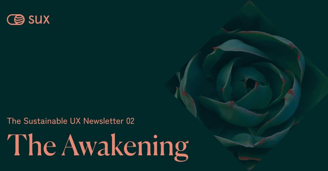
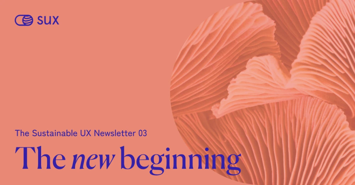
In addition to the neutral tones — a soft white with a subtle yellow tint reminiscent of paper and a charcoal black — four colors define the palette: peach red, vanilla yellow, forest green, and deep sea blue. These hues are designed to feel playfully vibrant, yet they’re used sparingly in combination and balanced with neutral elements to avoid an overly busy or whimsical appearance.
Imagery
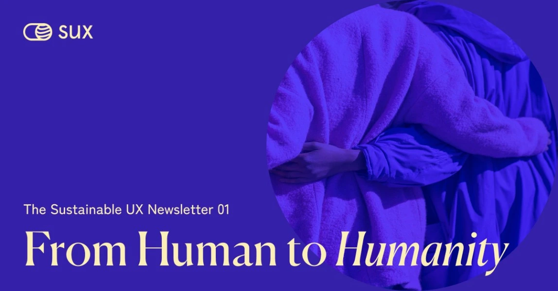
The visual style balances a mix of captivating nature scenes and unsettling environmental images. This carefully curated blend of contrasting motifs aims to convey authenticity — presenting nature as precious yet without glossing over the harsh realities that threaten it.
Shot predominantly from a bird’s-eye perspective, the distant, abstract, texture-like images create a feeling of overview and structure that makes the photographs an inspiring complement to a topic without becoming overly distracting from the core message.
Patterns & graphics
The imagery is enhanced by patterns and graphics that repeat the fundamental shapes of the logo, transferring visually the brand's key message: Connect (network of lines), collaborate (shapes in various forms) and change (contrast of blur and sharpness).
Typography
The conservatively styled serif typeface “Canela” by Commercial Type gives the brand a subtly academic character, serving as a counterbalance to the geometric forms when used boldly for big headlines.
That contrast is enhanced by the geometric sans-serif font "Apercu" for all other text elements, like the wordmark in the logo. For publications like digital apps and website, the open-source, geometric Google font "Zen Kaku Gothic New" is utilized for body text and UI elements.
Icons
The minimalist icon set “Dicut” by Charco Design seamlessly integrates into the SUX brand design, enhancing its cohesive visual identity. To maintain a visually understated impact and avoid an overloaded overall appearance, the icon set is used sparingly.
Stationary Design
SUX thrives on the impressive presentations of SUX speakers at conference stages around the world, as well as through online workshops and masterclasses. The events and courses are primarily promoted digitally, as a brand advocating for sustainability generously avoids the production of merchandising and printed promotional solutions. Consequently, the following design implementations have been produced in limited or single editions, or exist solely in digital form.
Website
Users can experience the brand, its story and mission in a clearly organized environment with a simple and well-structured one-page design that has been sustainably implemented in terms of image sizes and the avoidance of energy-intensive UX/UI patterns or heavy scripts.
Subbrand Design
SUX now includes three subbrands — SUX Playbook, SUX Podcast & SUX Academy — which are clearly aligned with the main brand design.
Each of their logos features a bold wordmark in the “Canela” font, with the smaller SUX logo positioned above it. This minimalist logo approach ensures easy scalability, allowing future subbrands to integrate seamlessly into the unified SUX identity.
Build together
With SUX Playbook, collaboration takes center stage. Together, participants explore sustainability topics and develop solution-driven methods, all made accessible to the public on SUX Notion for further use. The subbrand’s transformative, collective mission is symbolized by the repeated use of SUX shapes, resembling building blocks that represent the synergistic efforts of all involved.
Listen & get inspired
The brand design of the podcast highlights the network’s signature line pattern, representing both community connections and sound waves. This visual element underscores the podcast’s mission to deliver inspiring and informative audio content.
Externally sourced images, such as guest portraits on podcast episodes and teasers, are generally edited with color-monochrome filter techniques to create a unified look and maintain a cohesive overall aesthetic.




Learn & become
The subbrand SUX Academy offers online courses for aspiring Sustainable UX Designers. Its specific design is characterized by minimalist graphics, incorporating visual elements such as the sharpness-blurriness style and the recurring circle motif based on the globe in the SUX logo. These graphic arrangements transfer awareness and growth, emphasizing the academy's commitment to teaching sustainable design theories.
Community
The SUX brand design has become its defining mark, both within the community and beyond. For a globally connected group that interacts primarily online, a holistic, visual identity is essential in building a sense of unity and belonging.
Through Miro workshop boards, impactful keynotes and other branded platforms, thousands united to shape sustainable practices and create valuable guidelines. A unified brand design strengthens visual coherence and supports community growth, driving engagement, collaboration and collective progress.
In record time, SUX Network gained widespread popularity, connecting creatives and environmental experts to the SUX community worldwide through platforms like Slack and LinkedIn. Together, the members develop UX methods and patterns that promote mindful, resource-conscious digital product design, helping to reduce the environmental impact.
+6.000
SUX followers on LinkedIn
+2.400
active members in SUX Slack Channel
+1.000
average listeners per SUX podcast episode
+2.600
SUX Newsletter readers
